How To Build COVID-19 Dashboard

As part of regular learning cycle, I decided to learn Grafana and thus eventually reached to a point that I started using InfluxDB as the back-end database. Then I needed something to plot. I used telegraph & InfluxDB from the TICK stack to start plotting, statistics from my MAC as well as from NAS using SNMP. Then it dawned on me that I should make something which would test the InfluxDB to some extent, meaning having larger data set.
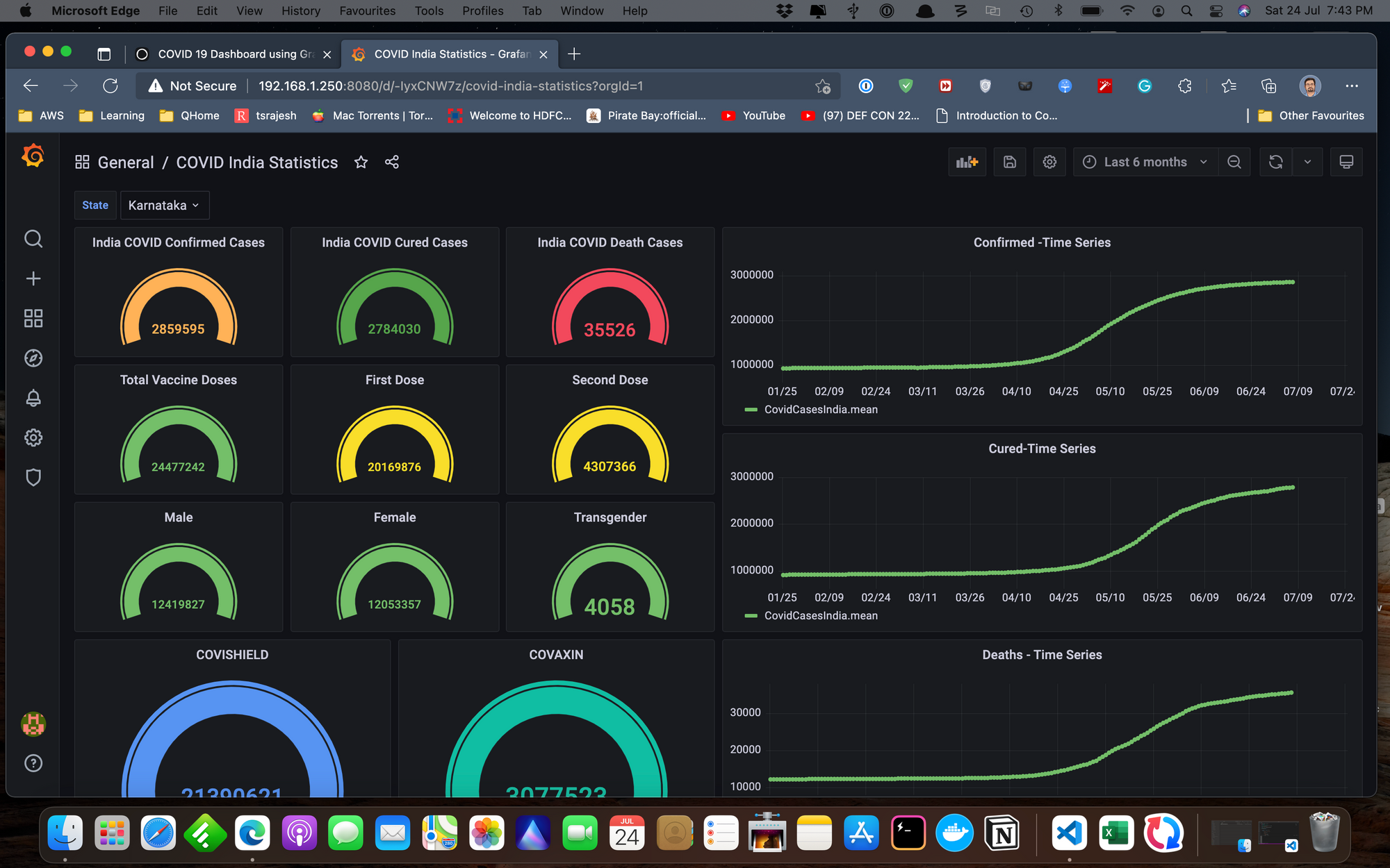
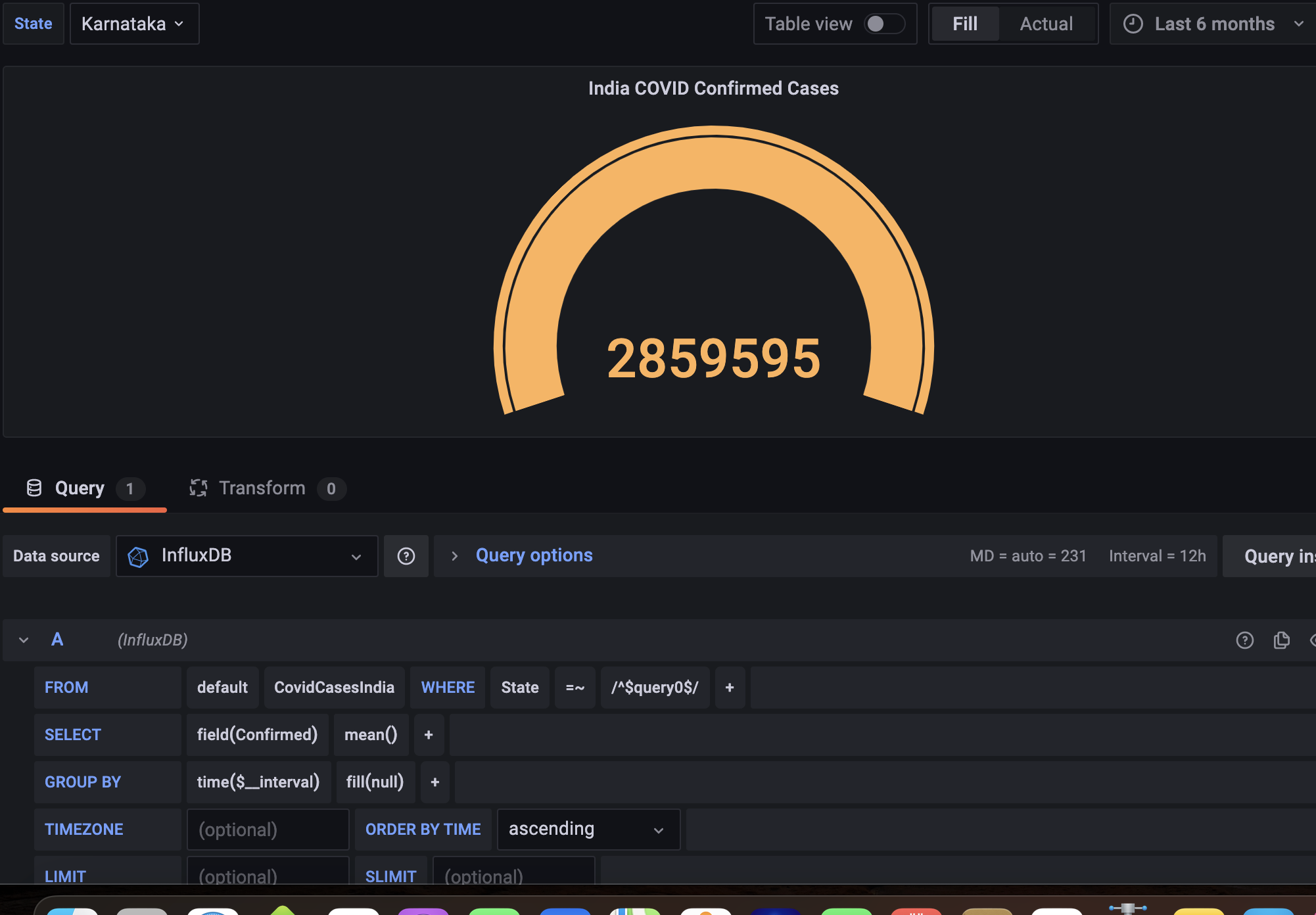
I ended up building what you see above. It is a nifty little dashboard showing the infection status, recovery rates, deaths etc., filtered based on Indian states.
I also plotted the present vaccination status in India, state-wise where you will be able to see type of vaccine, male, female, transgender etc. If you're with me so far and want to build something like this then follow along.
Grafana - Grafana is a dashboard framework which allows you to plot data against time, and the back-end can be many different databases and agents.
InfluxDB - InfluxDB is a time-series database, allowing you to capture data to the level of nanoseconds and still providing great performance.
If you follow along the links above, you'll be able to download and install it. Both of them have an Open Source license. It is rather straightforward and will not bore you with those details. If you want to run them in containers, they both offer docker container versions which you can download and Install. I used the docker version for both and was running those two instances in my NAS.
The third element needed is a dataset. If you just do a google search for COVID19 dataset, there are many that is available. I picked one from the datascience community portal Kaggle Follow this link to download the required dataset. There are two of them available.
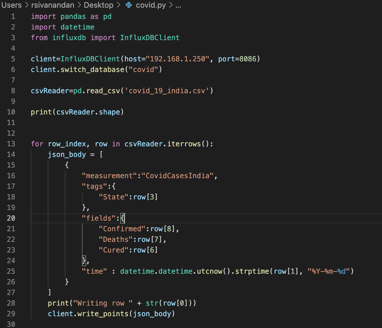
COVID19_india.csv -> this provides the data statewise.
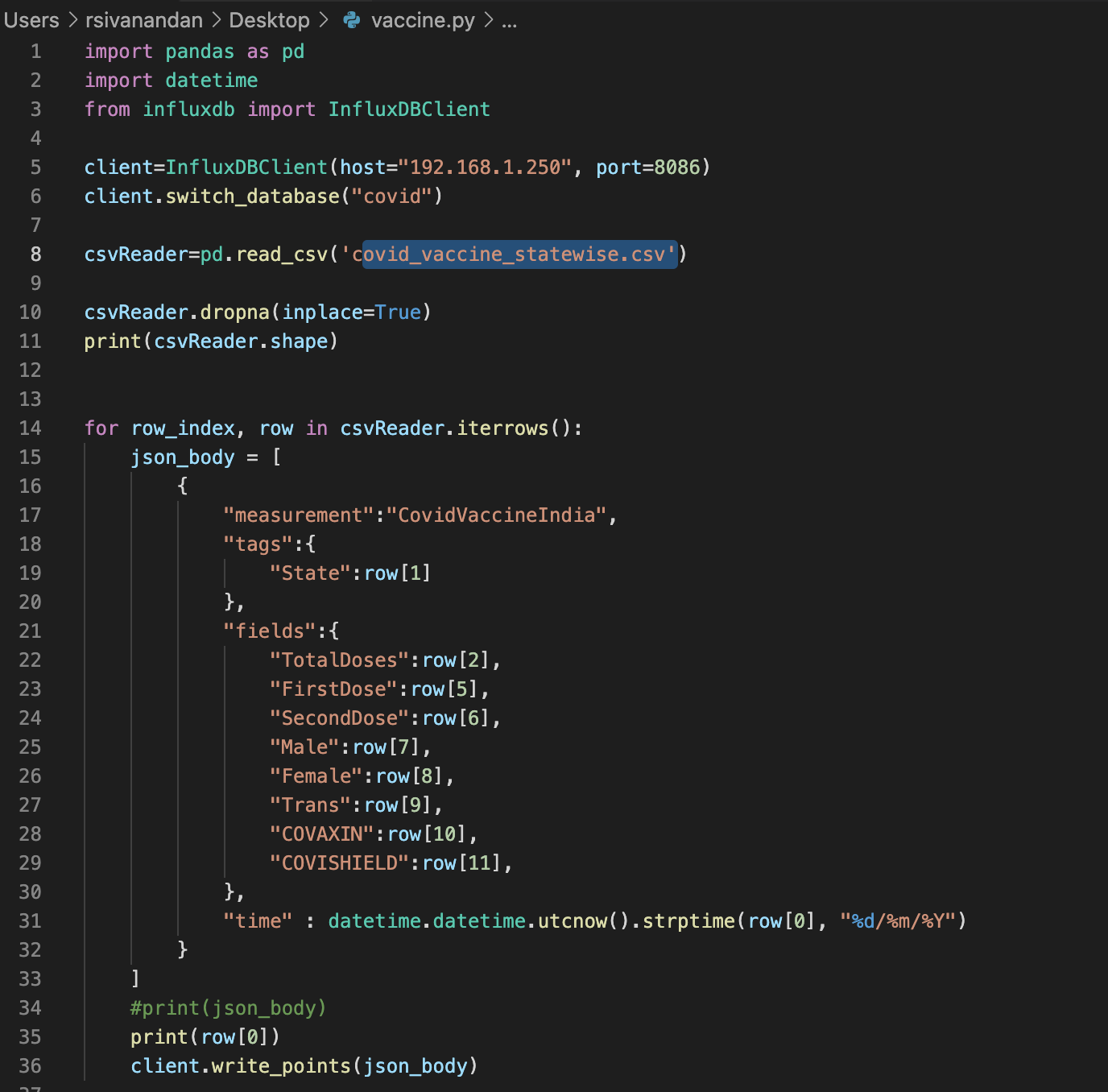
COVID19_vaccine_statewise.csv -> this one, in turn provides the statewise vaccination statistics.
InfluxDB follows a syntax which roughly can be described as below.
- Database -> means database
- Measurements -> rough equivalent of Tables
- Tags -> The row/column items that repeats itself and data relating to this element is the one which is varying. For example, from this dataset, this would be the 'name of the states'.
- Fields -> This is the data to be crunched. For example, in our case - it is the date and COVID stats for that particular date.
So you need to write some kind of a program to pick the data from the CSV files and input into the InfluxDB. I first created a database named 'covid'.
The following program would get all the values from covid19_india.csv into the influxdb and also convert the date to the format influxdb would accept.
Similary, the below python code would add the vaccination data from the file COVID19_vaccine_statewise.csv into the same 'covid' database into a different measurement.
Once you write the code either using the above or in the language of your choice, you can run it to save data to the influxdb.
Setting up Grafana
- Login to Grafana
- Add a data source pointing to the database 'covid' and 'save&test'. You would get a green tick mark if everything goes well.
- Then add a dashboard
- Add panels into the dashboard and use the query explorer below to select data from the database and display what you want to see.
I would highly recommend some of the Grafana tutorials on the youtube, there are several out there and I learnt it using them too.
There you go, keep creating panels for all the data that you want to view and you can play around with different types of data representation in Grafana.
It is an interesting project and I thoroughly enjoyed doing this, hope you find it useful too.